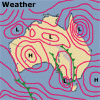
 The
weather map that appears in our newspapers or on T.V. is the result of
surface weather readings taken all around Australia. Upper atmosphere
information is gathered from weather balloons and satellite information.
Like a huge jig-saw puzzle, the weather map brings together temperature,
wind direction and strength, air pressure, rain and storm information
into one easy to read illustration.
The
weather map that appears in our newspapers or on T.V. is the result of
surface weather readings taken all around Australia. Upper atmosphere
information is gathered from weather balloons and satellite information.
Like a huge jig-saw puzzle, the weather map brings together temperature,
wind direction and strength, air pressure, rain and storm information
into one easy to read illustration.
Features of a weather map
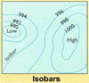 Typically,
a weather map is made of a series of high and low pressure zones interlaced
with warm or cold fronts. These high and low pressure zones are simply
called highs and lows. Sometimes two lows are joined by a region of low
pressure known as a trough.
Typically,
a weather map is made of a series of high and low pressure zones interlaced
with warm or cold fronts. These high and low pressure zones are simply
called highs and lows. Sometimes two lows are joined by a region of low
pressure known as a trough.
The lines on the map are called isobars and join places of equal air pressure. At sea level, the average air pressure is 1010hPa with highs typically up to 1030hPa and lows down to 990hPa.
 Wind
speed and direction indicators show the direction and strength of local
winds. The arrow points in the direction of the wind movement and the
number of strokes on the tail indicates the strength of the wind. Rain
is shown by hatching.
Wind
speed and direction indicators show the direction and strength of local
winds. The arrow points in the direction of the wind movement and the
number of strokes on the tail indicates the strength of the wind. Rain
is shown by hatching.
A very good explanation of words used in forecasting by the Bureau of
Meteorology can be found at: Weather
Words - Bureau of Meteorology
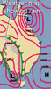
Using a weather map
![]() Wind
direction and speed can be quickly found by a close inspection of the
relative positions of the highs and lows and the closeness of the isobars
between them. The wind will blow from high pressure to low pressure, but
will also be affected by the rotation of the Earth. In the Southern Hemisphere,
winds move around high pressure systems in the anti-clockwise direction
and low pressure systems in the clockwise direction.
Wind
direction and speed can be quickly found by a close inspection of the
relative positions of the highs and lows and the closeness of the isobars
between them. The wind will blow from high pressure to low pressure, but
will also be affected by the rotation of the Earth. In the Southern Hemisphere,
winds move around high pressure systems in the anti-clockwise direction
and low pressure systems in the clockwise direction.
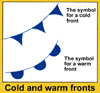 Cold
and warm fronts are typically felt as sharp changes in temperature created
by changes in wind direction. Fronts lie between high and low pressure
zones and mark the boundary between circling winds. Cold fronts usually
bring rain as moist warm air from a high mixes with colder air from a
low.
Cold
and warm fronts are typically felt as sharp changes in temperature created
by changes in wind direction. Fronts lie between high and low pressure
zones and mark the boundary between circling winds. Cold fronts usually
bring rain as moist warm air from a high mixes with colder air from a
low.
The weather systems typically move from the west in Southern Australia, so look towards Western Australia and South Australia for an indication of the weather to come over the next few days to a week in Victoria.
Warnings
The Bureau of Meteorology issues the warnings with forecasts. Explanations
of the terms used in Bureau warnings are given at: Bureau
of Meteorology - Storm Warnings
| Copyright owned by the State of Victoria (Department of Education and Early Childhood Development). Used with Permission. |